some practical tools that are available in the gpanel module for visualising function graphs..
EXAMPLES
The coordinate system can be freely selected when creating the graphics window with makeGPanel(). A coordinate grid is created with the drawGrid() function. The x and y range and the grid colour are defined.
Example 1: Draw a function in the coordinate system
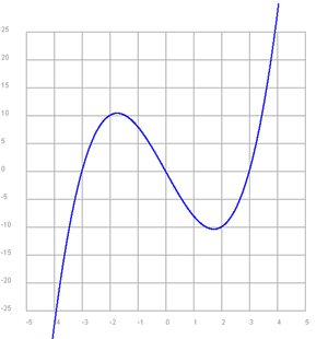
In the example, the function y =x3 - 9x is displayed in the coordinate system. With drawGrid(-5, 5, -25, 25, ‘gray’) the coordinate grid is drawn in the x-range -5..5 and in the y-range -25..25 in grey colour.
You must make the GPanel window slightly larger so that there is enough space to label the axes. Usually you enlarge the range on all sides by 10%, i.e. here x in the range -6..6 and y in the range -30..30.
In a while loop, the function value is calculated in small steps in the range -5 to 5 and displayed with the function draw(x, y). The new point is automatically connected to the old point. As the graphic cursor is initially located at point(0, 0), it must be set to the first function point with pos(x, y).
Program:
# Gp13a.pyfrom gpanel import *
makeGPanel(-6, 6, -30, 30)
drawGrid(-5, 5, -25, 25, "gray")
setColor("blue")
lineWidth(2)
x = -5
while x < 5:
y = x ** 3 - 9 * x
pos(x, y) if x == -5 else draw(x, y)
x = x + 0.01
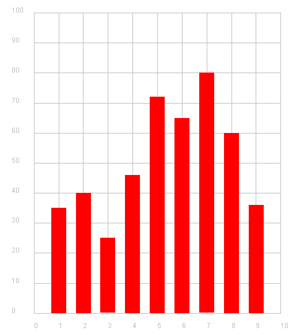
In this example, the values of a list, for example the results of a statistical analysis, are displayed in a frequency chart. You use the fillRectangle() function to draw the columns.
The maximum y-value of the grid (here 100) must be slightly larger than the largest value in the list.
In the documentation you can see that you can also use the drawGrid(x1, x2, y1, y2, x3, y3, colour) command, where you can also specify the number of ticks (division of the x or y axis) with x3 and y3.
Program:
# Gp13b.pyfrom gpanel import *
makeGPanel(-1, 11, -10, 110)
drawGrid(0, 10, 0, 100, "gray")
values = [35, 40, 25, 46, 72, 65, 80, 60, 36]
setColor("red")
x = 1
for y in values:
fillRectangle(x - 0.3 , 0, x + 0.3 , y)
x = x + 1
Python has many mathematical functions. To use these, you need to import the math module.
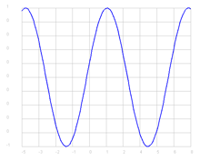
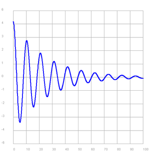
The function known from physics
y = ae-kx sin(ωt + π/2)
represents a damped harmonic oscillation. The function values are calculated using functions exp() , sin(), pi from the maths module. The documentation for the maths module can be found on the Internet at https://docs.python.org/2/library/math.html. It can be displayed directly in the TigerJython menu under Help/Python Docs.
Program:
# Gp13c.pyfrom gpanel import *
from math import exp, sin, pi
makeGPanel(-10, 110, -7, 7)
drawGrid(0, 100, -6, 6, "gray")
setColor("blue")
lineWidth(3)
x = 0
a = 5
k = 0.04
omega = 0.6
while x < 100:
y = a * exp(-k * x) * sin(omega * x + pi/2)
pos(x, y) if x == 0 else draw(x, y)
x = x + 0.1
delay(10)
With GPanel you can easily create diagrams and graphs of functions. You can freely select the coordinate system in the graphics window and create a coordinate grid using the drawGrid() function, which has several parameters.
TO SOLVE BY YOURSELF
1)
Draw the graph of the function
y = sin(x) für -5 < x < 8
To calculate the sine values, use the function y = math.sin(x) from the module math.
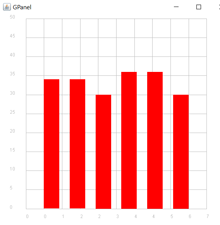
2)
The programme below simulates throwing a dice. A dice is thrown 200 times and the number of events with 1, 2, 3, ..., 6 is stored in the list a.
from gpanel import *
from random import randint

a = [0, 0, 0, 0, 0, 0]
n = 200
for i in range(n):
    r = randint(1, 6)
    if r == 1:
        a[0] += 1
    elif r == 2:
        a[1] += 1
    elif r == 3:
        a[2] += 1
    elif r == 4:
        a[3] += 1
    elif r == 5:
        a[4] += 1
    elif r == 6:
        a[5] += 1

print(a)
Display the frequencies in a bar chart.
3)
Two coins are tossed 200 times simultaneously. Plot the frequencies for the events
- twice heads
- once heads and once tails
- twice tails
with a bar chart.