| HomeTurtlegraficsGPanelRoboticsGameGrid WebTigerPython |
| Python - Online |
| Deutsch English |
16. NumPy and MatPlotLib
![]()
YOU LEARN HERE... |
how to import Python libraries numpy and matplotlib into WebTigerPython. |
WHAT IS NUMPY AND MATPLOTLIB? |
numpy is a Python extension module used for scientific calculations. Since this module is written in C, numerical calculations are performed much faster with numpy than with standard Python. In addition, nympy enriches Python with powerful data structures for efficient calculations with large arrays and matrices. |
EXAMPLES |
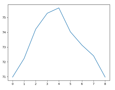
Example 1: Graphically visualising a data series Program: #Gp16a.py import numpy as np import matplotlib.pyplot as plt values = [20.1, 20.8, 21.9, 22.5, 22.7,21.8, 21.3, 20.9, 20.1] a = np.array(values) v = a * 9/5 + 34.789 print(v) plt.plot(v) plt.show()
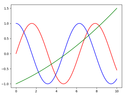
The function arange(start, stop, step)from the numpy module returns a half-open interval [start, stop) with a step distance between two consecutive values. Program: #Gp16b.py import numpy as np import matplotlib.pyplot as plt x = np.arange(0, 10.01, 0.01) f1 = np.sin(x) f2 = np.cos(x) f3 = 0.01 * x**2 + 0.15 * x - 1 plt.plot(x, f1, color="red") plt.plot(x, f2, color="blue") plt.plot(x, f3, color="green") plt.show()
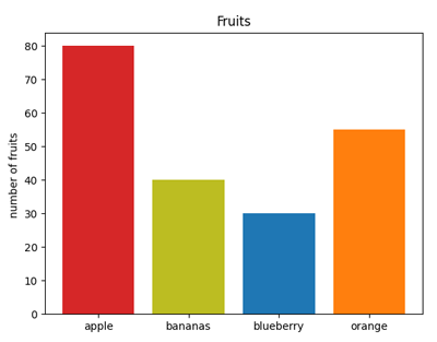
Example 3: Bar chart Program: #Gp16c.py import matplotlib.pyplot as plt fig, fx = plt.subplots() fruits = ['apple','bananas','blueberry', 'orange'] counts = [80, 40, 30, 55] bar_colors = ['tab:red','tab:olive','tab:blue','tab:orange'] fx.bar(fruits, counts, color=bar_colors) fx.set_ylabel('number of fruits ') fx.set_title('Fruits') plt.show()
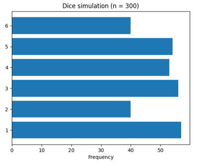
Example 4: Horizontal bar chart Program: #Gp16d.py import matplotlib.pyplot as plt import numpy as np from random import randint def countFrequency(): global a n = 300 for i in range(n): r = randint(1, 6) if r == 1: a[0] += 1 elif r == 2: a[1] += 1 elif r == 3: a[2] += 1 elif r == 4: a[3] += 1 elif r == 5: a[4] += 1 elif r == 6: a[5] += 1 fig, fx = plt.subplots() diceNumbers = ('1', '2', '3', '4', '5', '6') a = [0, 0, 0, 0, 0, 0] y_pos = np.arange(len(diceNumbers)) countFrequency() frequency = [a[0], a[1], a[2], a[3], a[4], a[5]] fx.barh(y_pos, frequency, align='center') fx.set_yticks(y_pos, labels=diceNumbers) fx.set_xlabel('Frequency') fx.set_title('Dice simulation (n = 300)') plt.show()
|
REMEMBER YOU... |
With import numpy and import matplotlib you extend WebTigerPython with powerful additional modules that you can use for scientific calculation and graphical representation of numerical material. |
TO SOLVE BY YOURSELF |
1) |
values = [35, 40, 25, 46, 72, 65, 80, 60, 36] a) with a line graph |
2) |
|
3) |
You can calculate the function values from the modulus np using the functions exp() , sin(), pi: f = a * np.exp(-k * x) * np.sin(omega * x + np.pi/2) Plot the function for the values |
![]()


